CASE STUDY:
SUGARTOWN WEB3 GAME UI/UX

Client: Zynga
Duration: 8 months
Role: Art Direction, UI/UX Design
Tools: Adobe Illustrator, Adobe Photoshop, Figma
PROJECT OVERVIEW
Working with the team at Zynga, my task as the Art Director was to establish a visual style and UX flows for their new Web3 game. Through many iteration cycles, we were able to arrive at a fun and elegant solution, which addressed the needs of the client but also worked well with the already-established style of the NFTs. Once the visual style was set, I oversaw the production of the rest of the screens and helped set them up for the dev team at Zynga. Art directing and managing the creation of the 3D map of Sugartown was also a large part of the project. Working closely with a 3D artist contractor and the client we were able to build and deliver a beautiful city, which aligned perfectly with the client's vision. A detailed and well-organized style guide was also included as part of the deliverables to the client.
DESIGN PROCESS
As the Senior UI/UX Designer on the project it was my job to explore styles, present ideas to the client, iterate and finalize designs, present UX solutions for new game features and accessibility, apply the approved style to the user flows and set up a style guide. Once this was completed I oversaw the handoff of files and visual assets to the client’s engineering team for implementation through Figma. Motion design was a large part of the project as well. Working with the motion designer and the client we were able to deliver a magical and elegant UI, which truly portrayed the magical aspects of the Lord Of The Rings lore.
FINAL DESIGNS
Once a style was established, working with a Senior UI/UX designer we applied the selected visual language to the final flows.


FINAL SCREENS


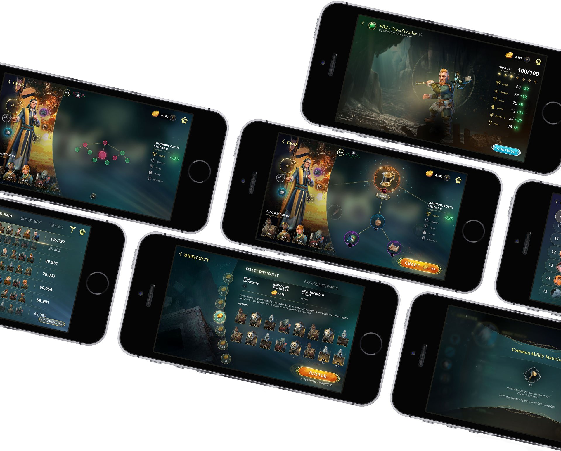
GEAR TREE UI/UX
One particularly challenging and rewarding aspect of the project was designing the UX for the gear tree. It needed to be highly informative, engaging, and easy to use. I developed several solutions to help players navigate this important and complex part of the game.
Firstly, the gear tree highlights and showcases the items the user is crafting and upgrading. The item's rarity is indicated through distinct frame treatments, and clear labels help the user see which items are missing with appropriate calls to action. For particularly large gear trees, I designed a mini-map to show the user’s current location within the tree, making navigation easier to understand. Tapping on the mini-map brings up a larger version, displaying which items are selected, which ones the user already possesses, and which ones are missing.
By using these techniques, I was able to create a visually stunning UI that prioritizes the user’s experience with this feature.


COLOUR PALETTE

TYPOGRAPHY

STYLE EXPLORATIONS
I started out by exploring a few stylistic options, which incorporated key asks from the client - circular elements, art nouveau, decorative, but not specific to any faction within the game. Elements with gold, without the UI feeling too heavy. These images were presented to the client, and the final style for the game UI was derived from these comps. Sketching was something I relied heavily on in this process, before moving on to the computer to capture the ornamentation and decorative elements for the UI.


BUTTON EXPLORATIONS
Several button options were presented to the client as well. The colours were finalized in this phase as well. When designing a UI I always keep motion and possibly approaches for UI animations in mind. Glows, special effects and anything that would make certain elements stand out or give a strong call to action are presented in the comps to help the client visualize the final product, as well as to serve as a guide for the motion designer.

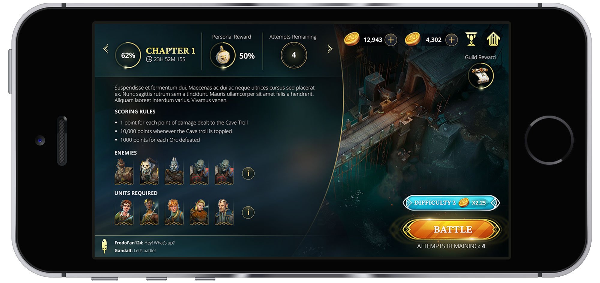
GUILDS BATTLES UX & UI
Once a style was approved, I moved on to working out the UX and UI for a key part of the game - Guild Battles. There were a series of complex screens to help the user get involved in and complete a series of time-sensitive battles as a guild, which resulted in guild and individual rewards. After several rounds of wireframe reviews with the client, we settled on a flow, which felt right. Next steps involved applying the selected style to the screens and handing off the final UI to the engineering team.


CHAPTER UI DESIGN
For the Guild Battles, chapters were marked by special markers that adhered to the project's established visual language. These markers featured an art-nouveau feel with intricate ornamentation and subtle circular motifs. The markers had to convey at-a-glance visuals to help users quickly understand their progress or the outcome of a battle.
Successful conquests were indicated by an ornate frame with green colours, pleasant glows, and particle effects. Failed states were represented by a more angular and darker design, with red tones and no gold ornamentation. This visual distinction ensured clear and immediate feedback for the users.

Active/incomplete chapter

Complete chapter - Success

Complete chapter - Failure
KEY TAKEAWAYS
Electronic Arts was a wonderful client, and the design process went extremely smoothly. This project involved developing and applying a complex and highly decorative design to a series of UI screens, presenting its own challenges. I creatively incorporated a circular, art-nouveau motif across various intricate menus while keeping implementation and a robust user experience in mind. This project taught me to look beyond a single screen and style, emphasizing the importance of looking at the bigger picture when designing a visual language for a product. It was a valuable lesson in creating a cohesive design that enhances the overall user experience.
The highly iterative process resulted in beautiful designs that were on-theme for the Lord of the Rings game while maintaining a modern look and ensuring a smooth player experience.